BRANDING + UX FOR EQUITAS HEALTH
Healthcare rebranding can feel overwhelming: so many stakeholders, so much on the line. But, it doesn’t have to be. I helped rename & rebrand AIDS Resource Center Ohio to Equitas Health, which better reflects their expanded services and leadership in the ever-changing healthcare industry. The project included a full rebrand, a new name, a new website, and a campaign microsite.
Work Categories
Brand Research Brand Strategy Creative Direction Naming UX Research UX DesignNaming a healthcare Leader
Who You Gonna Call?
At about 6:30 in the evening, just a few days before we were supposed to present the new name, logo, and brand architecture to the board, I got a call from the client. He said he’d had better days, and that we needed to come up with a new name. And fast.
Always Be Prepared
Fortunately, we had a ton of great research and a hardy brand architecture to clarify the gray areas.
It’s a Numbers Game
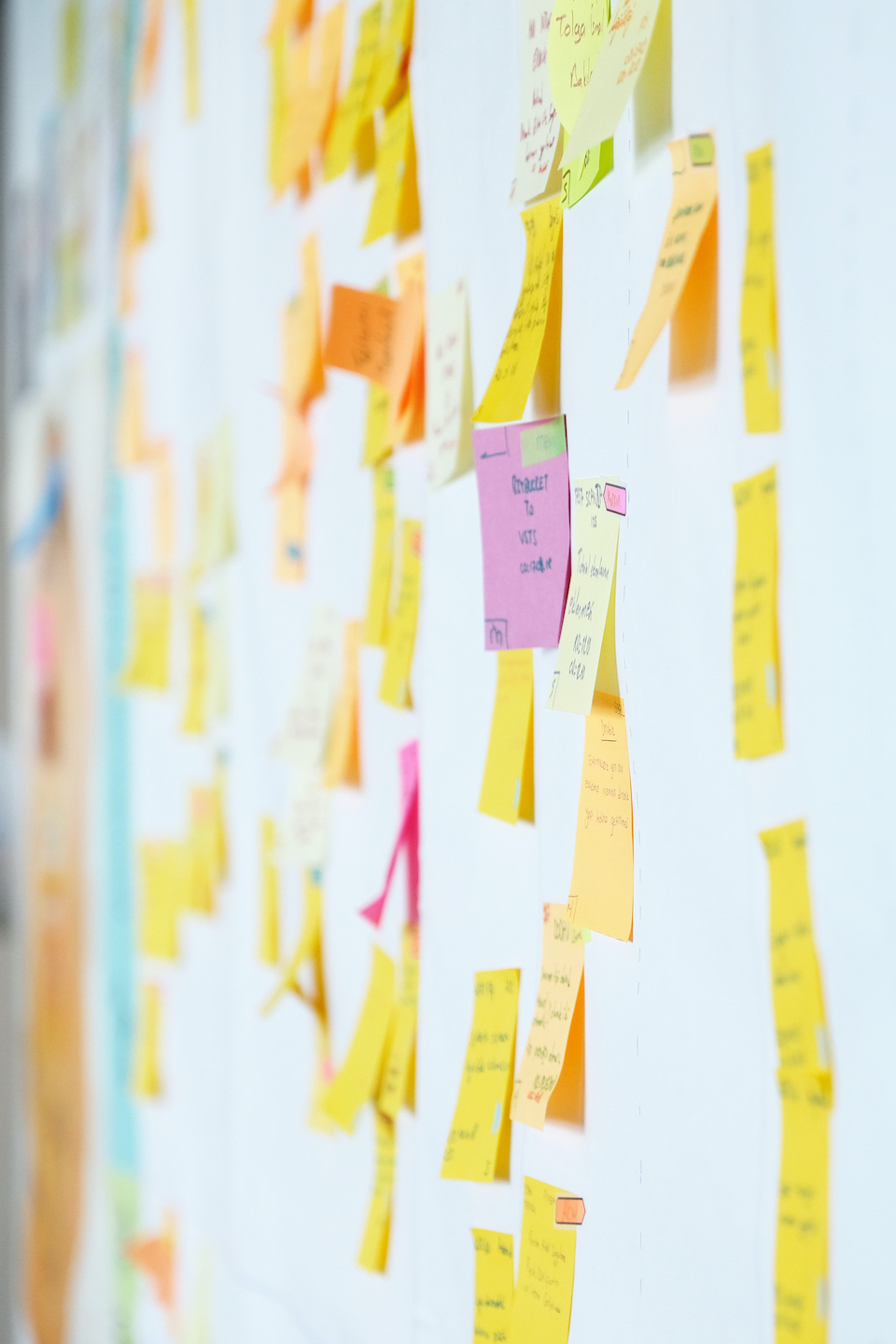
I gathered the team, some post-it notes & sharpies, and a healthy dose of creative urgency. We produced several dozen new names in less than a day.
Sweat The Details
Then, with some careful searching of USPTO and a little bit of Google-fu, the team and I delivered 18 on-brand, trademark-vetted names from which our client could choose. Ultimately, a clear winner stood strong above the rest: Equitas Health.
I led the team for this healthcare rebranding project to develop a new brand architecture for ARC Ohio. The synthesis of extensive primary and secondary research showed the importance of maintaining ARC Ohio’s focus on HIV/AIDS, providing culturally competent care for all, and leading the industry on LGBTQ healthcare issues and advocacy.
Moving pictures.
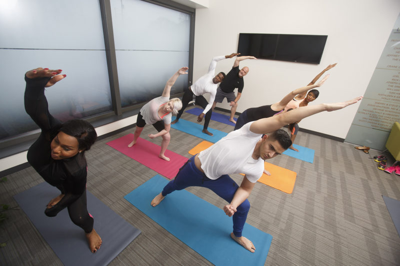
To complete the Equitas healthcare rebranding and #HealthOutLoud, we needed photos and videos that inform and inspire– pictures and video that create an emotional connection. Cement facilitated several multi-day, multi-location photo and video shoots.


Healthcare Rebranding Brought to Life Online
Through extensive keyword research, competitive market analysis, and qualitative and quantitative research we developed an exceptional UX foundation for the new website. The navigation is confident, simple and easy to follow. Additionally, the clear, compelling, consistent content brings the new brand story to life by always referring back to at least one of the “reasons to believe” from the new brand architecture.

User Experience Research
In order to create an entirely new website architecture, I led the team in several user experience research (UX research) techniques. We put the name of each service, location, and other items on their own paper index cards. We then asked a variety of internal and external stakeholders to sort the cards into groupings that made sense to them.
User Experience Design
The results of the card sorting were pretty phenomenal, and we developed an intuitive, simple site structure that users loved and client stakeholders understood and bought in to.
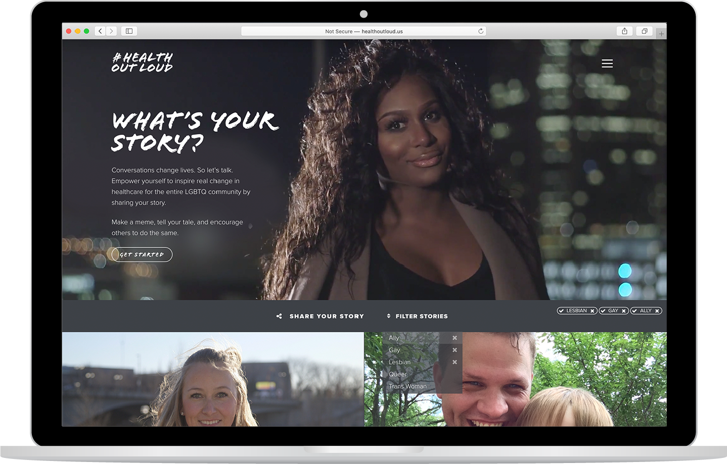
A Campaign to Improve Health Outcomes
Members of the LGBTQ community are at a disproportionately high risk for cancer, depression, suicide, and substance abuse. They’ve experienced discrimination in the healthcare space. What if we flipped that on its head, though, and created a safe space to talk about culturally competent care, how to demand it, and the risks of not? What if we could talk about LGBTQ health out loud?
I led the team to research, design, and develop a brand and microsite for Equitas Health called #HealthOutLoud. We created seceral video stories, conducted multiple photoshoots, and built out the entire campaign.
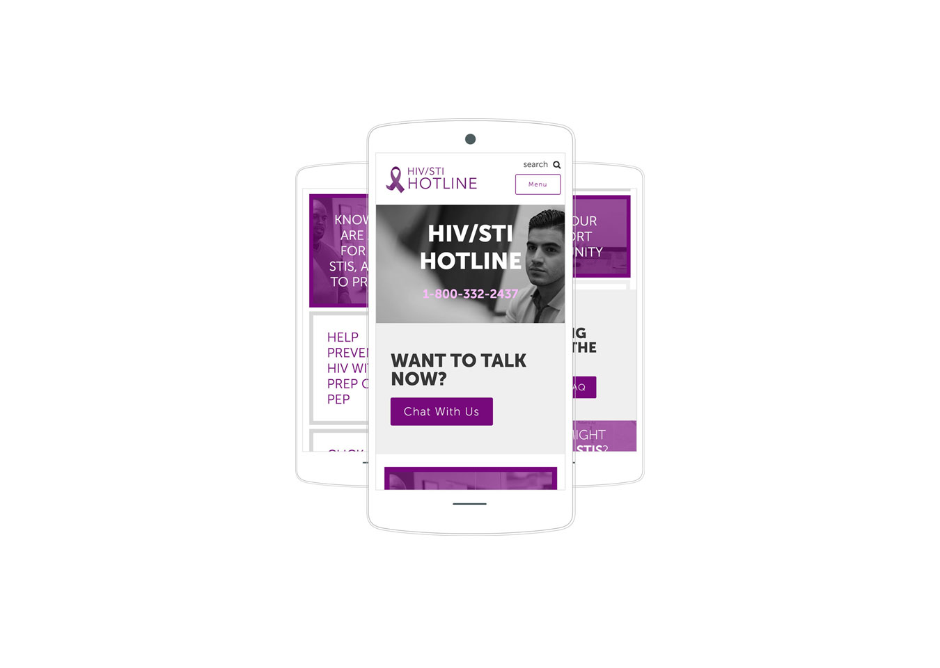
OHIV.ORG
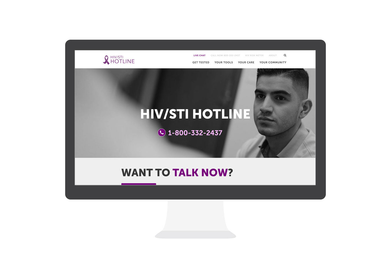
Tasked with breathing life back into a valuable but stagnated community resource, the Cement team created a new mobile responsive website for Ohiv.org, a state funded resource serving those in need of critical HIV and STI prevention or treatment services. The new site includes a live chat function, bountiful resource links and an interactive quiz. In addition to design and development, Cement’s project team also renamed the site’s domain to Ohiv.org.
Rank Well. Rank Often.
The new ohiv.org website design streamlines content into four areas: testing, tools, care and community. Previously the site had much more content which muddied the UX waters and made finding critical information tasking on the user.
Traffic increase of 1,500%
The website is now crushing it in search and social. Traffic is up more than 1,500%. Visits jumped from 183 uniques to a staggering 2,689 in the first full quarter after launch, with more than 20,000 form fills. More than 66% of the traffic is from organic searches alone.
How About We DO Something Amazing?
Ready to take your brand to the next level? Drop me a line and I'll get back to you ASAP. I promise not to ask too many questions.