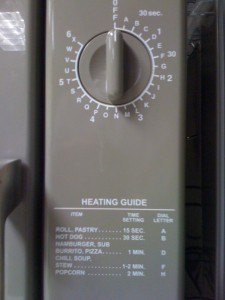
Take a look at this microwave.
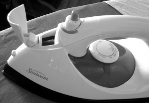
Now, take a look at this iron.
What glaring difference do you see–other than one cooks, and one irons? What were they thinking?
I’d venture that the microwave people thought about how to make their own lives simpler. Letters take up less space than numbers around that dial. A nice clean interface, right? Nope. We don’t think like that about cooking times: “Hmm, I’m going to cook my soup for F, stir, and cook for an additional U.” So they had to add the legend next to the actual cook time. Now it’s cluttered and confusing.
I bet the iron people thought about how to make their customer’s lives simpler. By orienting the opening for the water reservoir so it flips up when the iron is flat, it was much easier to fill using the sink instead of a cup or a funnel… or making a huge mess.
So, when you’re designing your next product/service/experience/ad/press release/story/joke/dinner, whatever you do, don’t imagine a mini devil-me on your shoulder asking: “what are you thinking?!”


Pretty nice post. I just came across your blog and wanted to say
that I’ve really enjoyed reading your posts. Anyway
I’ll be subscribing to your feed and I hope you post again soon!